Hello, I'm back with some more track logo concepts I cooked up today.
First up is Heartland Motor Speedway, the stand-in for Kansas, with warm sunset colors and wheat stalks in the middle of the track's shape. Pretty happy with this one, though the text might need some reworking.
Next up is College Station Motor Speedway, essentially Texas World Speedway, I decided to keep the globe, but situate it inside the track layout inside turns 3 and 4, while the text fills the left side of the logo. Texas A&M Aggies Colors complete the logo, giving it a pretty distinct character that is probably one of my best.
This is actually a track logo concept I have done before, now revised to make a much more coherent and less messy design. I like the colors on this, and the bold text helps draw the eyes in.
Mesa Marin is not one of the first tracks that comes to mind when you think of NASCAR, unless you are in tune with early truck series racing, but Marine Mesa is definitely a track on the potential inclusion list. This logo is a bit rough, but I feel the core idea is certainly solid.
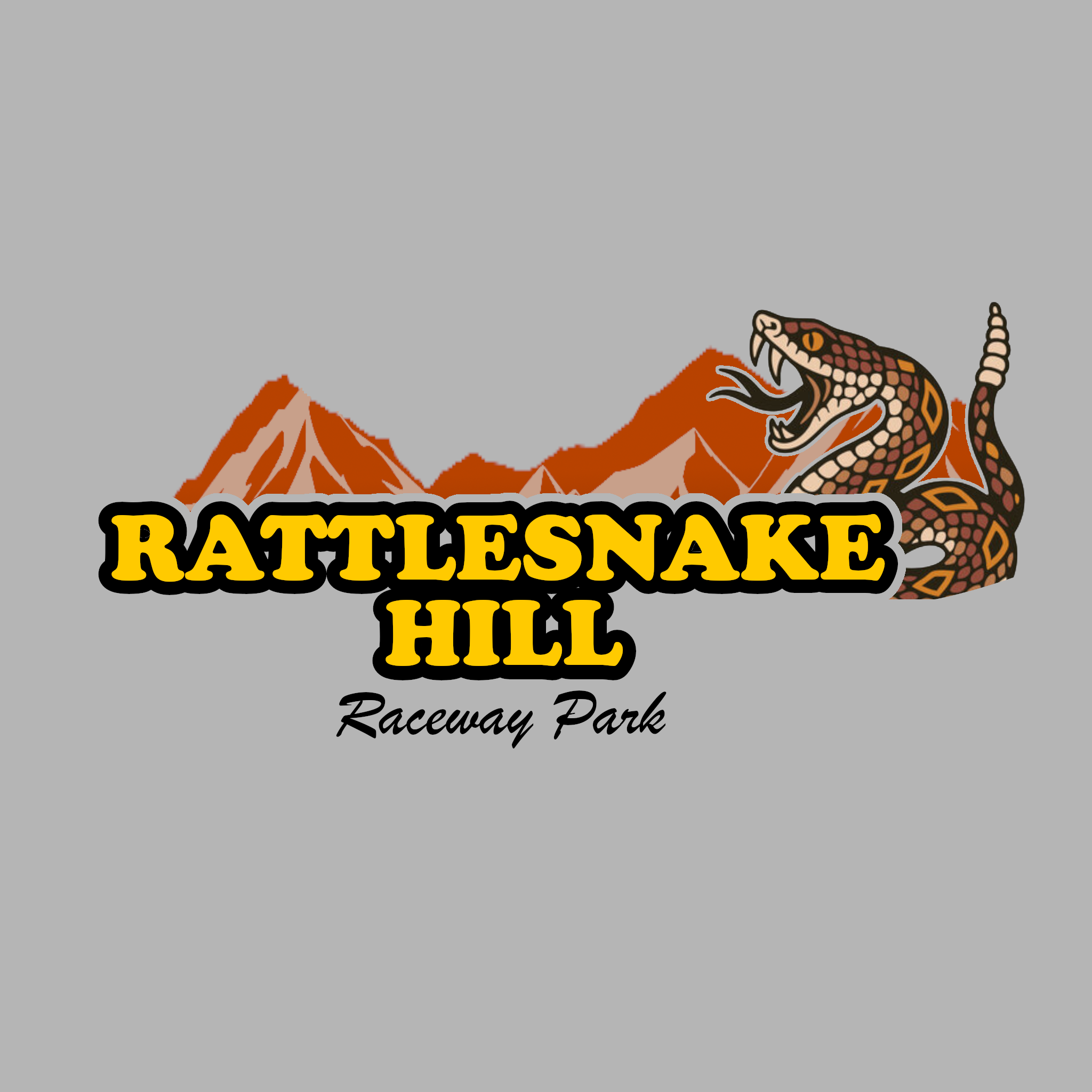
Continuing the Southwest Tour that has mostly been the past few logos, Rattlesnake Hill took a bit to come to me, as I had an idea of what I wanted, but couldn't quite fit the pieces together properly, until I cut negative space between the text, mountains, and titular snake.
Finally, back to the southeast, we have Ridgeway Junction, named after the town Martinsville Speedway is located at, plus the addition of the railroad tracks that run behind the track. I'm not the biggest fan of this one, the text font was meant to give an industrial vibe, but something just doesn't add up. This is probably going to get a revisit, along with Biscayne Bay.